
2 The Visual System
In Chapter 1, we established that a data visualisation can be thought of as an encoding from data values to data symbols and extracting information from a data visualisation involves decoding from data symbols back to data values.
We will consider many different ways to encode information in this book. For example, we have already seen that we can encode data values as different-coloured lines to create a line plot (Figure 1.1) or we can encode data values as different-coloured rectangles to create a heatmap (Figure 1.2). However, one thing that all of encodings that we consider will have in common is that they are visual encodings.
This means that the decoding of information from a data visualisation involves the human visual system. A good encoding will produce a data visualisation that the visual system is good at decoding. In this chapter, we look at some basic properties of the visual system.1 If we understand how the visual system works, we will begin to understand how data visualisations work.
2.1 The eye
In order for us to decode a data visualisation, we first have to see it. Light must emit from a computer screen or reflect off a page and enter the eye. Light passes through the pupil, is focused by the lens, and is projected onto the retina at the back of the eye. The retina contains around 100 million light-sensitive nerve cells and signals from those are combined into about 1 million nerve fibres in the optic nerve, which passes signals on to the brain (Figure 2.1).

One reason why data visualisation is effective is because our visual system gathers an enormous amount of information. For example, Figure 2.2 shows an image that is made up of over 17,000 individual visual elements, but we can easily consume the image and identify features without any difficulty.

2.2 Visual processing
Processing of the signals from the optic nerve occurs in several areas of the brain.2 Very basic visual features are extracted first, such as position, length, angle, colour, and pattern.3 This low-level information is passed on and built upon to produce higher-level visual elements, such as regions and shapes. Information is then also integrated from prior knowledge to assist with the identification of objects—things like trees, animals, and faces.4

Lower-level processing occurs subconsciously and more rapidly than higher-level processing, which can require conscious effort. Furthermore, lower-level processing occurs in parallel and can involve many instances of visual features at once, whereas higher-level processing will only focus on a small number of items or a single item at once. On the other hand, lower-level visual features are rapidly discarded as our attention shifts, while higher-level visual objects are more persistent and may even become part of long-term memory (Figure 2.4).
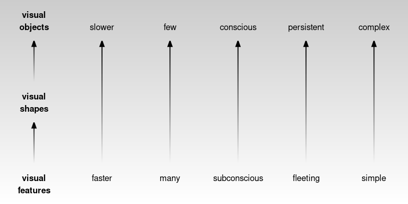
This means that, if we encode data values as simple visual features, like length, angle, and colour, then it will be possible to rapidly decode large amounts of simple information. We will look more at the encoding of data values as visual features in Chapter 3.
In addition, a smaller amount of more complex information will be decoded from higher-level processing of low-level visual features. We will look more at the decoding of multiple visual features in Chapter 8.
As an example, the image in Figure 2.2 encodes wind data values as many small triangles.5 Wind direction is encoded as the angle of the triangles and wind strength is encoded as the length of the triangles. Colour is used to encode whether the location is over the sea (blue) or over the land (green).
The visual system is able to effortlessly decode the basic visual features—angle, size, and colour—of many triangles at once. There is no need to consciously focus on every individual triangle in the image. At a higher level of processing, darker and lighter visual shapes are identified as regions of different colours. For example, a band of lighter wind forms a line from the top-left corner down and to the right at a roughly 45-degree angle. At a higher level of processing again, at least for the denizens of Oceania, the green regions are recognised as a very familiar visual object: the outline of New Zealand.
Importantly, many pieces of information, such as lighter and darker regions and even the shape of New Zealand, are decoded automatically. We do not have to deliberately search for these features and we do not have to be prompted by a question of interest to look for these features.
Encoding data values as simple visual features is effective at conveying simple information because the visual system decodes visual features rapidly and subconsciously.
The visual system also processes many visual features at once, producing more complex visual shapes or visual objects, which allow more complex information to be decoded. We will look more at the use of visual shapes and visual objects in a data visualisation in Chapter 10 and Chapter 12.
2.3 Visual focus
Figure 2.5 shows a slightly more detailed view of the structure of the eye (compared to Figure 2.1). The retina contains two types of light-sensitive cells: cones and rods. The cones are sensitive to colour and are concentrated very densely at the centre of the retina, in an area called the fovea. Rods only detect the amount of light (monochrome vision) and are spread more sparsely towards the periphery of the retina.
This arrangement means that, despite the experience of a complete, detailed field of view, we only get detailed and colourful information from a small foveal region (less than 5 degrees of visual angle). The information from our peripheral vision is less colourful and lower-resolution.6

Furthermore, when we view an image, we do not simply stare at the centre and see everything in the image. Instead, we perform a series of fixations, which are brief periods of focus on one area of the image, with saccades in between, which are rapid changes in the location of our focus. Figure 2.6 demonstrates that where we look within an image makes a difference.7
This means that, in order to decode detailed information from a data visualisation, we will need to switch focus between different areas of detail. For example, Figure 2.7 shows eye-tracking data from one person viewing an image for 10 seconds.8 The original image is shown on the left and eye-tracking data is shown on the right, with hollow black circles showing the position of the coloured circles in the original image. In the eye-tracking image, the fixations are shown as purple circles and the saccades are shown as lines between the circles. We can see, for example, that the viewer has fixated multiple times upon the large, colourful circles in the original image and has also fixated on the text at the top and bottom of the image.

This feature of our visual system provides an argument for keeping things simple. If we can only decode information from an image in a piecemeal fashion, then the fewer locations that we are required to focus on the better. A data visualisation will be slower to decode and require more effort to decode if it requires the viewer to constantly switch focus.
2.4 Visual memory
When we switch focus between different areas of an image, we need to remember information from a previous area of focus. How well can we hold visual information in memory?
The most important feature of visual memory is that it is very limited. We can only hold in memory a small amount of information at once.9
Figure 2.8 provides a simple demonstration of the limitations of visual memory.
It is easier and faster to decode information from visual elements if they lie within the scope of a single visual focus. If we have to switch focus, it not only takes longer to decode information, but we may hit limits on our ability to remember visual elements from previous areas of focus.10
The limits on visual memory reflect well-known limits on working memory—we can only memorise a small number of visual features at once. On the other hand, those limits can also be worked around via familiar mechanisms such as chunking.11 For example, we may only be able to hold in memory a small number of basic visual features such as the colours of circles, but we can effectively hold many more basic visual features if we memorise more complex visual elements that are composed of many basic visual features. In other words, we can remember several visual shapes or visual objects even if we cannot remember all of the individual visual features within those visual shapes or visual objects (Section 2.2). For example, we can hold in memory multiple country flags even though we cannot necessarily hold in memory all of the invidual colours on those flags.
Once again, the obvious conclusion is to keep things simple, so that there is less to remember during decoding, though this is tempered by the fact that more complex visual shapes may allow more to be remembered, especially if they are recognisable visual objects.
A data visualisation will require more effort to decode if the viewer is required to switch focus and remember visual information across multiple areas of visual focus.
As an example, the image in Figure 2.9 is based on the same wind data as Figure 2.2. However, in Figure 2.9 the data symbol is a circle rather than a triangle, with the wind strength encoded as the size of the circle and the wind direction encoded as the colour of the circle: southerly winds are black, westerly winds are red, easterly winds are green, and northerly winds are blue. This data visualisation is problematic for several reasons, several of which relate to the demands on visual focus and visual memory.
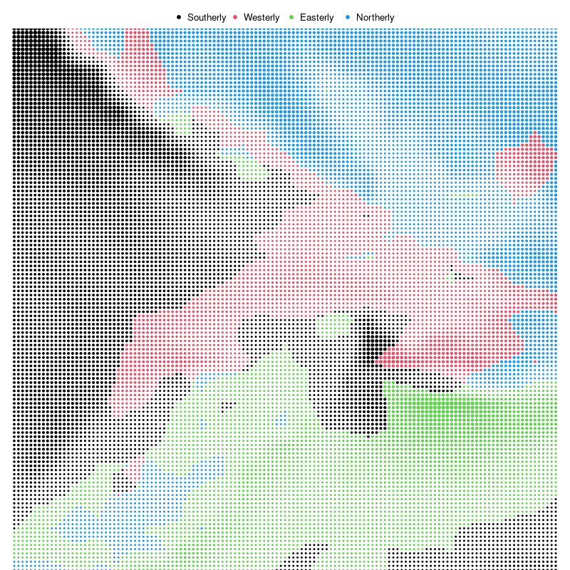
As with Figure 2.2, we identify some features of Figure 2.9 automatically. For example, we can immediately identify different regions of different colours, plus darker and lighter regions. However, if we want to decode wind information from Figure 2.9 we have more work to do.
In Figure 2.2, we can naturally decode wind direction from the angles of the triangles, but the decoding of wind direction in Figure 2.9 requires a legend. For example, there needs to be an explanation that black dots represent southerly winds. There is no natural correspondence between the colours used for the encoding and the wind directions. This means that we have to switch focus between the dots in the main image and the dots in the legend. Furthermore, we may have to switch focus repeatedly if we forget one of the encodings. Without looking at Figure 2.9, can you recite the colour-to-wind-direction encodings yet? This requirement to switch focus and memorise encodings makes it more difficult to decode the wind information from the image in Figure 2.2 compared to the image in Figure 2.2.
By contrast, in Figure 2.2, there was no need for a legend because we were able to decode wind direction naturally from the angles of the triangles. We will look more at this sort of natural decoding of information in Chapter 7.
2.5 Visual differences
The ability to gather a large amount of basic features from an image very quickly (Section 2.2) is supplemented by rapid visual processing that combines and summarises the information. These subconscious processes decode some information from an image without any mental effort.
For example, in Figure 2.10 (a) we can detect the one teal dot amongst the 24 orange dots without effort. Figure 2.10 (b) shows that this task remains effortless even if the number of dots is much larger.12 This ability to identify an item that is different from all other items within an image also applies to other basic features like size, as shown in Figure 2.11.


If an item differs on more than one visual feature, the effect is even stronger (Figure 2.12). This means that the visual system is very sensitive to items that are different in terms of basic visual features.


On the other hand, if the distractor items are similar on one visual feature, but different on another, and if the arrangement of the items is less structured, then finding a particular item of interest becomes much harder. For example, if we look for the single larger teal dot in Figure 2.13, it is much harder to find than it is in Figure 2.12. The visual system’s sensitivity to different items is much greater when all other items are the same.13


This means that encoding data values as data symbols that differ only in terms of basic visual features will be effective for decoding unusual data values, especially if everything else remains the same.
As an example, there is a single red triangle in Figure 2.2 that encodes the location of the strongest wind. This triangle is very easy to identify, even amongst more than 17,000 triangles.
2.6 Visual attention
Where we focus within an image is not random. The figures from Section 2.5 show that our attention is automatically drawn to the larger, brighter, and more colourful items within an image. This happens due to very early visual processing and without conscious thought.14
A data visualisation will be effective for decoding important data values if it uses basic visual features like colour to draw the viewer’s attention. As an example, it is not only easy to identify the single red triangle in Figure 2.2, it is actually quite difficult to ignore it.
Where we focus within an image, and what information we extract, is also affected by conscious goals—what are we looking for?15 For example, when you were looking for the larger teal dot in Figure 2.13, did you notice that there was also a single small orange dot? Now that your attention has been drawn to that task, it will be easier to find the smaller orange dot.16
A data visualisation will be effective for decoding important data values if it includes instructions that direct the reader’s attention. We will look more at the text labels on a data visualisation in Chapter 13.
2.7 Visual similarities
In Figure 2.13, we can see several groups of items: orange dots, teal dots, large dots, and small dots. These separate groups of items are identified based on their similarity—each group of items has the same size and the same colour. The flip side of being able to easily identify items that are different (Section 2.5) is that we can also easily identify items that are the same.
The grouping of similar items within an image also happens automatically and without conscious effort. Figure 2.14 shows pairs of dot matrices that are very similar, but in one matrix of each pair we see rows and in the other matrix we see columns. For example, in the middle pair, items that are the same colour produce groups that are either rows or columns.
There are other visual properties that mean we automatically perceive items as groups: items that are close together (items that have similar positions) are seen as a group so we see either rows of black dots or columns of black dots on the left of Figure 2.14; items that are connected by lines are also seen as a group so we see either connected rows or connected columns on the right of Figure 2.14.17

These grouping effects are very powerful and can even be used to override each other in some combinations. Figure 2.15 shows that an enclosing border can be stronger than a connecting line, connecting lines can be stronger than proximity, and proximity can be stronger than similarity.

Another type of automatic grouping is demonstrated in Figure 2.16. On the left is a collection of dots. We naturally perceive a horizontal line and a circle from these dots, as shown in the centre of Figure 2.16. We automatically complete lines, particularly smooth curves, even when the curve is broken, as in the central set of dots. We do not tend to complete lines with sharp corners, as indicated on the right of Figure 2.16.18

All of this means that if we encode data values from the same group using the same position or colour, or if we connect them with lines, or if we enclose them within a border, then
the visual system will automatically decode the group information.
One way that a data visualisation can be effective is by relying on on the automatic decoding of visual groups (proximity, similarity, etc). As an example, we automatically identify separate groups of triangles in Figure 2.2 (land versus sea) and separate groups of dots in Figure 2.9 (different wind directions), just based on the common colours of the triangles or dots. No effort is required to decode these groups. We will look more at the decoding of groups in Section 3.4.
2.8 Visual simplicity
Figure 2.17 shows an arrangement of dots, similar to Figure 2.16. The collection of dots on the left has an ambiguous interpretation. Is this a single shape, or two overlapping shapes (as indicated in the centre of Figure 2.17), or some complex combination of multiple shapes (as indicated on the right of Figure 2.17)?
Our visual system has a preference for the simple interpretation. Given an ambiguous arrangement of visual elements, we will tend to perceive whatever is most orderly, regular, and coherent.19

Figure 2.18 shows that we also perceive groups when items have a symmetric arrangement.20

This is another argument for simplicity in a data visualisation, but also for regularity and orderliness. These results suggest that we should design a data visualisation so that it leads the viewer where they already want to go rather than trying to force them to decode a more complex interpretation.
A data visualisation may be easier to decode if it is orderly and lends itself to a simple interpretation. As an example, the image in Figure 2.19 encodes a subset of the wind data from Figure 2.2 and Figure 2.9. The data symbol in Figure 2.19 is a wind barb, which represents the wind direction as the angle of a line and the wind strength as small tick marks on the tail of the line.
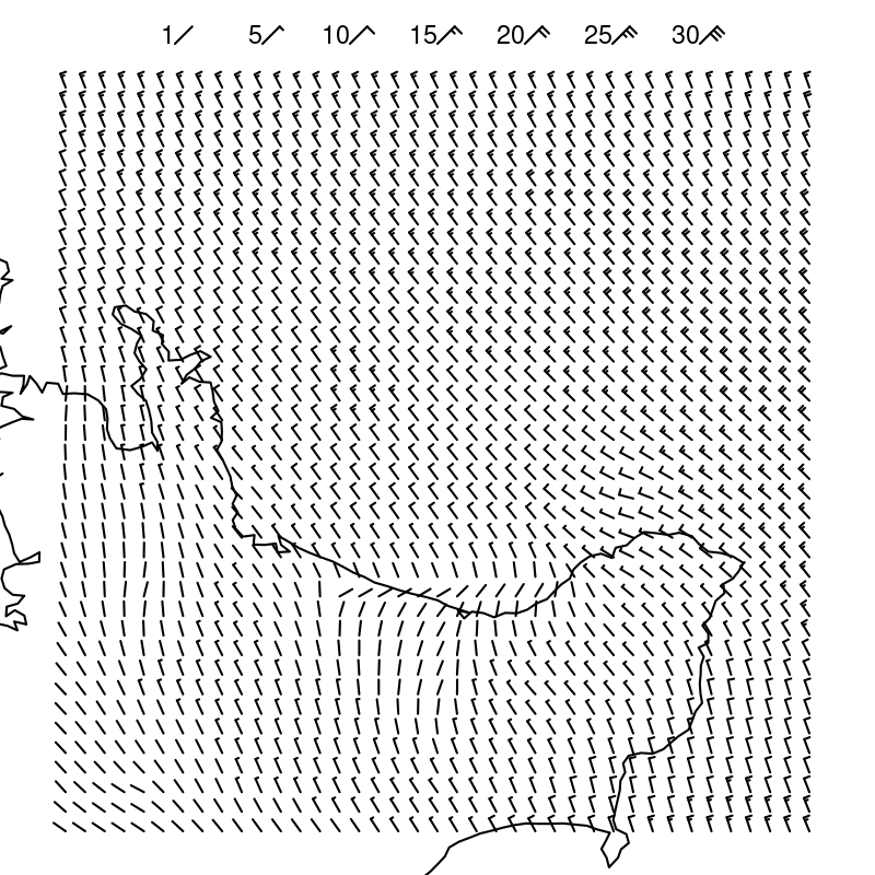
There is also an outline of the coast of (the North Island of) New Zealand in Figure 2.19. Although the outline of the coast overlaps with the wind barbs in many places, in most places we are able to decode the coast as a single continuous shape separate from the individual barbs. The continuous coastline crossed by smaller barbs is a simpler decoding than any other interpretation.
2.9 Visual tasks
Identifying whether visual elements are the same or different (Section 2.5 and Section 2.7) is an example of a very simple visual task. Figure 2.20 (on the left) shows another simple visual task: judging the ratio of two different lengths. These tasks are rapid and require very little effort.

However, on the right of Figure 2.20 is an example of a task that is much more difficult. In this task, we have to identify which of the four shapes in the bottom row is not a rotated version of the shape at the top. This task requires much more deliberate effort and time to perform.21
The point here is that we should create data visualisations that can be decoded using simple visual tasks. That is how we can fulfil the promise of data visualisation. It is far less useful to create a data visualisation that forces us to expend significant mental effort in order to decode useful information. A data visualisation will be effective if it relies on automatic and rapid visual processing rather than requiring conscious mental effort.
An example of a relatively simple visual task is the decoding of wind direction from Figure 2.2. For example, at the right of Figure 2.2, about half way up the image, we can see a region where the wind is circling around a point. By contrast, identifying that location in Figure 2.9 is much more difficult. The location in Figure 2.9 is marked by a point where all four colours meet, but decoding that the wind is circling at that location requires decoding the four wind directions and then combining the four directions to conclude that the wind directions form a circle.
2.10 Dangers of the visual system
The value of data visualisation comes from the visual system’s ability to rapidly gather and process a large amount of visual information. However, while data visualisations usually consist of artificial and simple images presented on a two-dimensional page or screen, the visual system has evolved for the unstructured, messy, and three-dimensional natural environment. This means that the visual system will sometimes generate a more sophisticated, but erroneous interpretation of an image from a very simple arrangement of basic shapes. In other words, we are vulnerable to visual illusions.
For example, Figure 2.21 shows the Muller-Lyer Illusion and the Ebbinghaus Illusion. In the former, two horizontal lines of the same length appear to have different lengths and, in the latter, two orange circles of the same size appear to have different sizes.22

Figure 2.22 shows another set of illusions involving simple lines. Every line segment in this image is the same physical length, but we perceive some segments as longer than others.23

Figure 2.23 shows two images that are composed of three simple parallelograms. The three parallelograms are arranged separately on the left, which means that we decode them as three simple shapes. However, for the arrangement of the parallelograms on the right, the natural decoding is a 3-dimensional box, even though the image is clearly 2-dimensional.

These examples demonstrate that the visual system can produce incorrect or unintended results for even very simple visual tasks based on very simple visual elements. If we encode data values in such a way that we produce a visual illusion then the decoding will be wrong and will not lead back to the orginal data values.
Visual illusions can destroy the effectiveness of a data visualisation because they lead to an incorrect decoding of information. We will see an example of how our visual system can sometimes work against us in Section 6.3.
2.11 Summary
There are features of the human visual system that mean that we can decode some information extremely rapidly and without effort:
A very large amount of basic information is gathered at once about simple visual features like positions, lengths, and colours.
Large, bright, colourful items automatically attract attention.
We automatically identify groups of items within an image based on similarity of basic visual features like position and colour, plus connecting lines and enclosing borders.
On the other hand, there are limitations of the visual system that suggest encodings that we should avoid:
Detailed information is only available at the centre of the visual field.
Visual memory is extremely limited.
These features suggest that encoding data values as basic visual features and generating simple, orderly data visualisations will lead to rapid and effortless decoding of information.
Bowman, Daniel C., and Jonathan M. Lees. 2015. “Near Real Time Weather and Ocean Model Data Access with rNOMADS.” Computers & Geosciences 78: 88–95. https://doi.org/10.1016/j.cageo.2015.02.013.
Cairo, Alberto. 2012. The Functional Art: An Introduction to Information Graphics and Visualization. New Riders.
Carpenter, Patricia A., and Priti Shah. 1998. “A Model of the Perceptual and Conceptual Processes in Graph Comprehension.” Journal of Experimental Psychology: Applied 4 (2): 75–100. https://doi.org/10.1037/1076-898X.4.2.75.
Coren, Stanley, and Joan S. Girgus. 1978. Seeing Is Deceiving: The Psychology of Visual Illusions. Oxford, England: Lawrence Erlbaum.
Franconeri, Steven L., Lace M. Padilla, Priti Shah, Jeffrey M. Zacks, and Jessica Hullman. 2021. “The Science of Visual Data Communication: What Works.” Psychological Science in the Public Interest 22 (3): 110–61. https://doi.org/10.1177/15291006211051956.
Gregory, Richard L. 1963. “Distortion of Visual Space as Inappropriate Constancy Scaling.” Nature 199 (4894): 678–80. https://doi.org/10.1038/199678a0.
Howe, Piers D. L., and Dale Purves. 2005. “The müller-Lyer Illusion Explained by the Statistics of Image–Source Relationships.” Proceedings of the National Academy of Sciences 102 (4): 1234–39. https://doi.org/10.1073/pnas.0409314102.
Itti, L., C. Koch, and E. Niebur. 1998. “A Model of Saliency-Based Visual Attention for Rapid Scene Analysis.” IEEE Transactions on Pattern Analysis and Machine Intelligence 20 (11): 1254–59. https://doi.org/10.1109/34.730558.
Knudsen, Eric I. 2020. “Evolution of Neural Processing for Visual Perception in Vertebrates.” Journal of Comparative Neurology 528: 2888–2901. https://doi.org/10.1002/cne.24871.
Künnapas, T M. 1955. “An Analysis of the "Vertical-Horizontal Illusion".” Journal of Experimental Psychology 49 (2): 134–40.
Marois, René, and Jason Ivanoff. 2005. “Capacity Limits of Information Processing in the Brain.” Trends in Cognitive Sciences 9 (6): 296–305. https://doi.org/https://doi.org/10.1016/j.tics.2005.04.010.
Matzen, Laura E., Michael J. Haass, Kristin M. Divis, Zhiyuan Wang, and Andrew T. Wilson. 2018. “Data Visualization Saliency Model: A Tool for Evaluating Abstract Data Visualizations.” IEEE Transactions on Visualization and Computer Graphics 24 (1): 563–73. https://doi.org/10.1109/TVCG.2017.2743939.
Mckee, Suzanne P., and Ken Nakayama. 1984. “The Detection of Motion in the Peripheral Visual Field.” Vision Research 24 (1): 25–32. https://doi.org/https://doi.org/10.1016/0042-6989(84)90140-8.
Miller, George A. 1956. “The Magical Number Seven, Plus or Minus Two: Some Limits on Our Capacity for Processing Information.” Psychological Review 63 (2): 81–97. https://doi.org/10.1037/h0043158.
Müller-Lyer, Franz Carl. 1889. “Optische Urteilstäuschungen.” Archiv für Physiologie Suppl., 263–70.
Ninio, Jacques, and Kent A Stevens. 2000. “Variations on the Hermann Grid: An Extinction Illusion.” Perception 29 (10): 1209–17. https://doi.org/10.1068/p2985.
Rosenholtz, Ruth. 2016. “Capabilities and Limitations of Peripheral Vision.” Journal Article. Annual Review of Vision Science 2 (Volume 2, 2016): 437–57. https://doi.org/https://doi.org/10.1146/annurev-vision-082114-035733.
———. 2023. “Peripheral Vision: A Critical Component of Many Visual Tasks.” Oxford University Press. https://doi.org/10.1093/acrefore/9780190236557.013.878.
Schurgin, Mark W., John T. Wixted, and Timothy F. Brady. 2020. “Psychophysical Scaling Reveals a Unified Theory of Visual Memory Strength.” Nature Human Behaviour 4 (11): 1156–72. https://doi.org/10.1038/s41562-020-00938-0.
Sönning, Lukas. 2023. “Drawing on Principles of Perception: The Line Plot.” In Data Visualization in Corpus Linguistics: Critical Reflections and Future Directions, edited by Lukas Sönning and Ole Schützler. Studies in Variation, Contacts and Change in English 22. Helsinki: VARIENG. https://urn.fi/URN:NBN:fi:varieng:series-22-2.
Stewart, Emma E. M., Matteo Valsecchi, and Alexander C. Schütz. 2020. “A Review of Interactions Between Peripheral and Foveal Vision.” Journal of Vision 20 (12): 2–2. https://doi.org/10.1167/jov.20.12.2.
Titchener, Edward Bradford. 1916. Experimental Psychology: A Manual of Laboratory Practice. Vol 1. Qualitative Experiments. Part i: Student’s Manual. New York, NY : Macmillan Publishing,.
Todorovic, D. 2008. “Gestalt Principles.” Scholarpedia 3 (12): 5345. https://doi.org/10.4249/scholarpedia.5345.
Treisman, Anne. 1985. “Preattentive Processing in Vision.” Computer Vision, Graphics, and Image Processing 31 (2): 156–77. https://doi.org/https://doi.org/10.1016/S0734-189X(85)80004-9.
Tufte, Edward R. 1990. Envisioning Information. Cheshire, CT: Graphics Press.
Van Essen, David C., Charles H. Anderson, and Daniel J. Felleman. 1992. “Information Processing in the Primate Visual System: An Integrated Systems Perspective.” Science 255 (5043): 419–23. https://doi.org/10.1126/science.1734518.
Wagemans, Johan, James H Elder, Michael Kubovy, Stephen E Palmer, Mary A Peterson, Manish Singh, and Rüdiger von der Heydt. 2012. “A Century of Gestalt Psychology in Visual Perception: I. Perceptual Grouping and Figure–Ground Organization.” Psychological Bulletin 138 (6): 1172–1217. https://doi.org/10.1037/a0029333.
Ware, Colin. 2021. Information Visualization: Perception for Design. 4th ed. Morgan Kaufmann.
Wikipedia contributors. 2025. “Visual System.” In Wikipedia. https://en.wikipedia.org/wiki/Visual_system.
Wolfe, Jeremy M., and Todd S. Horowitz. 2017. “Five Factors That Guide Attention in Visual Search.” Nature Human Behaviour 1 (3): 0058. https://doi.org/10.1038/s41562-017-0058.
Simple descriptions of the human visual system can be found in many articles and books on data visualisation, for example, Cairo (2012), Franconeri et al. (2021), and Sönning (2023). See Ware (2021) for a more in-depth, but still very accessible description. Wikipedia also has some very helpful content (Wikipedia contributors 2025).↩︎
A rough estimate is that more than 50% of the brain is involved in visual processing (Van Essen, Anderson, and Felleman 1992).↩︎
Low-level visual processing involves the creation of feature maps that identify colours, edges, and orientations, along with the spatial arrangement of those basic features within the field of view (Ware 2021, 146).
Patterns, or textures, are perceived at a slightly higher level, based on low-level perception of spatial frequencies (fine detail versus coarse detail).↩︎
A slightly more detailed overview is provided in Ware (2021; 2021, 20).↩︎
Figure 2.2 is based on wind data from the National Oceanic and Atmospheric Administration’s Operational Model Archive and Distribution System (NOMADS). The data were accessed on September 14 2024 and processed using the {rNOMADS} package (Bowman and Lees 2015), with raw data interpolated to a finer grid.↩︎
This is not to say that peripheral vision is useless. Peripheral vision contributes significantly to our field of view (Stewart, Valsecchi, and Schütz 2020; Rosenholtz 2016), and is as capable as foveal vision at detecting motion (Mckee and Nakayama 1984). However, our ability to perceive fine details is limited to a relatively small area of focus.↩︎
This image is a demonstration of the extinction illusion, which is related to the better-known Hermann grid illusion (Ninio and Stevens 2000).
This illusion is not explained simply by differences in foveal versus peripheral perception—there is currently no complete explanation for the effect—but it serves to show that we are getting different information from different regions of the field of view.↩︎
The plot was originally from The Economist, but this image was taken from the resources provided on the MASSVIS project web site. The eye tracking data were taken from the same web site. Cite MASSVIS article. Only a thumbnail version of the original image is shown in Figure 2.7 in order to comply with terms of use of the MASSVIS data set.↩︎
Some limitations of visual memory are briefly mentioned in Ware (2021) (pages 397-405 and pages 423-425).
Schurgin, Wixted, and Brady (2020) mentions a limit of only “three or four items”!
The limitations of visual memory are also more complex than just a number of visual items (Marois and Ivanoff 2005):
“The first limitation concerns the time it takes to consciously identify and consolidate a visual stimulus in visual short-term memory (VSTM), as revealed by the attentional blink paradigm. This process can take more than half a second before it is free to identify a second stimulus. A second, severely limited capacity is the restricted number of stimuli that can be held in VSTM, as exemplified by the change detection paradigm. Finally, a third bottleneck arises when one must choose an appropriate response to each stimulus. Selecting an appropriate response for one stimulus delays by several hundred milliseconds the ability to select a response for a second stimulus (the ‘psychological refractory period’)”↩︎
Tufte refers to this as drawing “within the eyespan” (Tufte 1990, 67)
“In understanding human visual perception, an important component consists of what people can perceive at a glance. If that glance provides the observer with sufficient task-relevant information, this affords efficient processing. If not, one must move one’s eyes and integrate information across glances and over time, which is necessarily slower and limited by both working memory and the ability to integrate that information.” (Rosenholtz 2023).↩︎
Miller’s famous paper “The Magical Number Seven, Plus or Minus Two: Some Limits on Our Capacity for Processing Information” (Miller 1956) talks about limits on working memory, but also how to “escape” those limits, for example, by chunking information.↩︎
The ability to detect features without conscious effort is called pre-attentive processing or pop out (Treisman 1985).↩︎
For example, from Wolfe and Horowitz (2017): “Salience of a target increases with difference from the distractors (target–distractor heterogeneity) and with the homogeneity of the distractors (distractor–distractor homogeneity) along basic feature dimensions.”↩︎
Saliency maps (e.g., Itti, Koch, and Niebur 1998; Matzen et al. 2018), which attempt to predict where the viewer will focus attention, are based on the idea that attention is drawn to basic visual features like colour, angle, and size.↩︎
Having a conscious target to search for not only directs our visual focus (Section 2.3), but also filters the processing of visual input to exclude visual features that are not of interest (Knudsen 2020). In other words, to some extent, we see what we are looking for!↩︎
Wolfe and Horowitz (2017) describe “Bottom-up, stimulus-driven guidance” versus “Top-down, user-driven guidance”.↩︎
These visual effects are known as the Gestalt Grouping Principles (Wagemans et al. (2012)). The Proximity Principle says that items that are close to each other form a group. The Similarity Principle says that items that have the same colour or size form a group. The Connectedness Principle says that items that are connected to each other form a group. The Common Region Principle says that items within the same bounded region form a group. Todorovic (2008) provides a very accessible description of these principles and several others.↩︎
This is the Gestalt Continuity Principle (Todorovic 2008): Items that lie along a smooth curve form a group.↩︎
This is the Gestalt Prägnanz Principle (Todorovic 2008): The tendency to seek simplifying structure and to find order within the chaos of an image.↩︎
This is the Gestalt Symmetry Principle (Todorovic 2008): Items that exhibit symmetry will form a group (in preference to items that do not exhibit symmetry).↩︎
“the comprehension of visual displays tends to be easiest when simple pattern identification processes are substituted for complex cognitive processes” (Carpenter and Shah 1998, 98)↩︎
The original publication of the Muller-Lyer illusion (in German) is Müller-Lyer (1889), though in that, the stimulus described is a single line with three sets of arrows, as shown below.

The Ebbinghaus Illusion is also known as the Titchener Illusion after its English-language populariser (Titchener 1916).
Various evolutionary explanations of these illusions have been proposed, e.g., (Gregory 1963) and (Howe and Purves 2005).↩︎
Künnapas (1955) provides an in-depth exploration of this sort of illusion.
Coren and Girgus (1978) points out that the figures on the left and the right are actually combinations of the horizontal-vertical illusion and the Oppel-Kundt illusion (dividing lines influence the perception of extent to either side), which is similar to the Baldwin illusion (the size/extent of surrounding objects or lines influences the perception of the extent of a target line or gap). All of these have obvious parallels in the standard construction of popular data visualisations.↩︎