
14 Encoding Composition
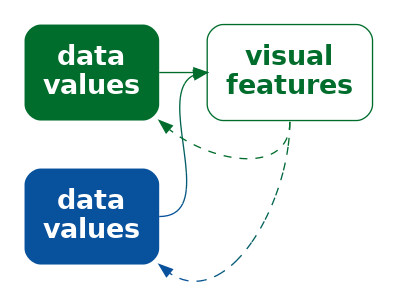
Figure 14.1 shows a line plot of the rate of youth crime in New Zealand for different ethnic groups and a pie chart showing the proportions of different types of crime.1 There is a problem with this figure because the line plot and the pie chart share the same colour palette even though they are visualising different variables (ethnicity and crime type). For example, the ethnic group European/Other is encoded as the orange colour of a line and the crime type Theft is also encoded as an orange colour, in this case the colour of a wedge.
The conflicting encodings in Figure 14.1 create a confusing data visualisation because the same visual feature decodes to multiple data values (Figure 14.2). The colour orange decodes to both Eurpean/Other and Theft. There is nothing invalid with the encodings in the line plot by itself or with the encodings in the pie chart by itself, but the overall combination of elements within Figure 14.1 is ineffective.
The problem in Figure 14.1 involves the coordination, or lack thereof, between multiple elements of a data visualisation. In this chapter we look at the arrangement and coordination of the elements of a data visualisation.2
14.1 Encoding structure
Figure 14.3 shows a scatter plot of the number of clean breaks and the number of tries for countries at the 2023 Rugby World Cup (Table 9.1). This data visualisation is similar to Figure 9.4, but with an additional encoding of the hemisphere for each country as the colour of the data points.
The legend in Figure 14.3 encodes the colour encoding: which colour is used to encode each hemisphere (Section 13.9). In Section 13.9, we described how the proximity of the labels “South” and “North” to the coloured points in the legend allow us to associate the colours with the different hemispheres and the different values of hemisphere are encoded as the vertical positions of the points and the text labels in the legend; both the orange point and the label “South” have the same vertical position.

What about the horizontal position of the points and the text in the legend? These do not encode hemisphere values because they are the same for both North and South. What about the position of the legend title, the text “hemisphere”?
All of the elements of the legend are positioned together and to the right of the main plot. Their proximity to each other (and separation from the main plot) mean that we see the legend as a separate group (Section 2.7). This creates a visual organisation for the plot, which helps the viewer to navigate and comprehend the different elements of the plot.3 This is analogous to reading a body of text, which is split into paragraphs and sections with headings to help the reader navigate the text.
One way to express this arrangement of the legend is that the position of the elements of the legend encode the structure of the overall data visualisation (Figure 14.4). Our visual system decodes the legend as a separate element based on the proximity of the text and points in the legend.

One way in which a data visualisation can be effective is if it provides information about how to read the plot as a whole as well as information about the data values.
Another way to think about it is that each element of the data visualisation in Figure 14.3 belongs to one of two groups: the main plot or the legend. There is a qualitative value—plot or legend—associated with each element of the data visualisation. These qualitative values are encoded as the position of the elements within the data visualisation: the plot is on the left and the legend is on the right.
Although we are no longer talking about encoding data values as data symbols, we are still talking about encoding. We are just encoding and decoding a different sort of information—the structure or organisation of a data visualisation.
Figure 14.5 shows a variation of Figure 14.3, with exactly the same plot elements, but in a slightly different arrangement. There is greater separation of the legend from the main plot. The legend has also been moved so that its top is aligned with the top of the main plot. Similarly, the axis titles have been moved so that they align with the top and right sides of the plot, and the y-axis label has been rotated to horizontal. More subtly, the right edge of the y-axis label is aligned with the right edge of the y-axis tick labels and the points in the legend are aligned with the left edge of the legend title.

All of these changes are aimed at making the data visualisation more orderly (Section 2.8).4 The legend is more obviously a separate element from the main plot and the axis titles more obviously connect to the main plot. A more orderly arrangement of the visual elements will provide fewer distractions and lead to a more effective data visualisation because the important differences in the data will be more readily perceived (Section 2.5).
The strong alignment and regular patterns within facetted plots like Figure 11.4 are another effective example of keeping everything else the same in order to champion the changes in the data. Conversely, another weakness of placing data symbols on maps, like in Figure 12.16 (b), is that the lack of regular positioning and alignment makes it harder to attend to the important differences between data symbols.
14.2 Unintentional encodings
One important idea in this chapter is that we can encode more than just data values or data summaries as visual representations. For example, the previous section showed that we can encode different groups of elements within a data visualisation using position—elements that are positioned close together and/or aligned with each other form visual groups.
Another way to say this is that we can decode the differences in the positions of different elements to identify distinct groups of elements.
Yet another way to say this is that we can decode visual differences regardless of whether they reflect differences in data values.
In other words, all visual differences in a data visualisation matter.
For example, consider the x-axis title in Figure 14.3. Although it has a similar horizontal position to the rest of the x-axis, it has a unique vertical position within the data visualisation. Similarly, the horizontal position of the y-axis title is unique, as are the horizontal and vertical positions of the legend. Because these positions are unique, we are tempted to decode those differences—we seek the information that is encoded in those differences. Put simply, the unique positions of certain elements of the plot make the data visualisation more complex.
Figure 14.5 is a more orderly version of Figure 14.3 and, as a consequence, there are fewer visual differences, so there is less to decode. The data visualisation is less complex.
Although we may notice the differences in the unique placement of axis titles in Figure 14.3 and therefore attempt to decode information from them, the differences do not deliberately encode information. These differences are unintentional encodings.
Figure 13.9 provides another simple example of unintentional encoding. In this bar plot there are text labels at different angles—the y-axis title is rotated 90 degrees and the x-axis tick labels are rotated 45 degrees, but these differences in angle do not reflect any differences in the data. Keeping all text in a data visualisation horizontal, as in Figure 14.5, removes this source of distraction.
Figure 14.6 shows a more problematic example.5 This bar plot shows the number of ex-smokers in New Zealand over time, with each bar resembling a cigarette that is slowly burning down (the grey area represents ash at the end of the cigarette). The number of ex-smokers is encoded as the full height of each bar, so we can decode the number of ex-smokers. However, the grey area and the white area on each bar also changes each year and those changes are not associated with any data value. In other words, there are differences that we decode as a change in something, but nothing is really changing. This is at best confusing and could even lead to misinterpretation.6

A choropleth map like Figure 12.14 provides a more subtle example of an unintentional encoding. Each region in the choropleth map is different in multiple ways. Each region has its own colour, which reflects the data values that are explicitly encoded and allows a decoding of the crime rate for each region. Each region also has its own position and shape, which reflect the geography of the physical world and allow a decoding of the region itself. However, each region also has its own size, which again reflects the geography of the physical world, but is less useful for decoding the region itself and permits an unintentional decoding of larger data values from larger regions. That is either a problem if it incorrectly confuses the decoding of crime rate from the colour of each region or it is a problem if it provides a distracting decoding of region size.
14.3 Consistent encodings
In Figure 14.3, the legend explains the encoding of the different hemispheres, North versus South, as different colours. This is achieved by drawing coloured data points in the legend just like the data points in the main plot, plus, crucially, using the same encoding in the main plot and in the legend. The green dots in the main plot correspond to North and the green dot in the legend corresponds to North. The encoding in the main plot is consistent with the encoding in the legend.7
Although it may seem obvious to have a consistent encoding of colour in both the main plot and the legend, Figure 14.7 demonstrates that we can harness consistent encodings to actually improve upon the original Figure 14.3. In Figure 14.7, the encoding of hemisphere as the colour of points is not only consistent between the main plot and the legend, but it has been extended to the colour of the legend text as well. The visual grouping of elements that relate to the same hemisphere is now stronger both within the legend and across the entire data visualisation (Section 2.7).

Another consistency in Figure 14.7 (and the original Figure 14.3) is the use of the same data symbol in both the main plot and the legend. Circular data symbols are used in both cases. That consistency, like the use of consistent colours, might again appear obvious, but it is not always true. For example, the data symbols in Figure 14.8 are circles, but the legend is a rectangular colour gradient.
Figure 14.8 shows a correlation matrix of seven performance measures for teams in the 2023 Rugby World Cup (Table 9.1). Variable names are encoded as the horizontal and vertical positions of circles and the correlations between variables are encoded as the colours of the circles. We can see that many measures have quite a strong positive correlation (dark red circles), but one measure (the number of tackles per game) is negatively correlated with all other measures (though often only very weakly).

Figure 14.9 shows a variation of Figure 14.8 with a legend that not only shares the same colour encoding, but also shares the same data symbol. It is much easier to compare the colour of one of the data symbol circles in the main plot with the colours of the circles in the legend because they are all circles.

Figures Figure 6.15 and Figure 6.16 are other examples of this consistent encoding between legends and the main plot. The legends in those cases are drawn so that they mirror the positions of the bars in the main plot as well as the colours of the bars in the main plot.
14.4 Inconsistent encodings
Figure 14.10 shows a bar plot of the impact of a proposed tax bill during the second Trump administration.8 Each bar represents the predicted change in annual income for a particular income bracket. Lower incomes are to the left and higher incomes are to the right. There are labels to describe each income bracket and there are labels that describe each change in income. Where the change in income is large, the label for change in income is written within the bar (at the top of the bar), but for smaller changes in income, the bar is too small to fit the label, so the label is placed just above the bar. For the two leftmost bars, the change in income is actually negative and the change in income label is placed below the bar. The labels that describe the income brackets are mostly below the bars, but for the two leftmost bars the labels for the income brackets are placed above the bars.

In summary, there are two labels for each bar, one below the bar and one above (or at the top of) the bar. This consistent positioning of the labels encourages the viewer to decode two groups of labels: one group above the bars and one group below the bars. However, this will mislead us into comparing, for example, “-1K” (a change in income) for the leftmost bar with “4.3M” (an income bracket) for the rightmost bar. The correct comparison is between “-1K”, which is the change in for the lowest income bracket, and “389.3K”, which is the change in income for the highest income bracket.9
Just as it makes no sense to change the encoding of data values within a data visualisation or across multiple data visualisations within the same document (Figure 14.1), it makes no sense to change the encoding of structure within a data visualisation. In this case, all labels above the bars should belong to the same group of labels (changes in income) and all labels below the bars should belong to the same group of labels (income brackets).
14.5 Encoding importance
Figure 14.11 shows a variation on Figure 14.7 with many elements of the plot drawn in light grey. The effect of this change is to create two visual groups, one lighter and less saturated than the other. This emphasises the main data symbols in the main plot and in the legend, and de-emphasises the axes and labels. Our attention is drawn to the darker and more saturated elements first (Section 2.6), with the other elements in the background, which we can focus on if we need the additional information.10

By comparison, in Figure 14.7 there is a similar visual impact from all elements of the plot, so it is less clear where to look first. All of the elements of the data visualisation compete for our attention. Figure 14.12 emphasises this point by making all axis and legend text black and adding black grid lines. The data symbols are now lost amongst the non-data elements of the plot.11

The use of colour in Figure 14.11 is another example of encoding (qualitative) non-data values as visual features. In this case, we are encoding the importance of different visual elements as visual features (Figure 14.13). We decode the differences in colour to a group of more important elements and a group of less important elements.

Figure 14.14 shows a similar application of importance. In this case, we are highlighting two data points (New Zealand and South Africa). The distinct colour and larger size of the two points encodes the importance of those points and draws attention to those points, with the other data points de-emphasised.

14.6 Unimportant encodings
When we encode importance, we are relying on basic properties of the visual system to draw attention to specific elements of a plot (Section 2.6). As we saw in Section 2.10, those basic properties of the visual system can also work against us. Our attention will be drawn to large and bright elements of a data visualisation automatically. For example, in Figure 14.15, our eye is drawn to the tiger’s eye, which distracts us from the more important heights of the bars. There are clear overlaps here with the ideas of clutter and chart junk (Section 12.6).
As with many of the most effective approaches to encoding information, we have a lot to gain by aligning our encodings with the natural decodings that our visual system provides, but we have a lot to lose if our encodings are misaligned with our desired goals.

14.7 Summary
Just as we can encode data values to visual features, in order to communicate information about the data, we can encode non-data information to visual features, in order to communicate important aspects of the structure of a data visualisation.
The structure or organisation of a data visualisation, or the importance of specific elements, can be effectively encoded as the position or colour of different elements of the data visualisation.
Communicating structure and importance helps the viewer to navigate within the data visualusation, which makes it easier to decode information from the data symbols within a data visualisation.
Cabouat, Anne-Flore, Lorenzo Ciccione, Samuel Huron, Tobias Isenberg, and Petra Isenberg. 2025.“Bridging Educational Theories of Cognitive Load to Visualization Design and Evaluation .” In 2025 IEEE VIS Workshop on Visualization Education, Literacy, and Activities (EduVIS), 33–64. Los Alamitos, CA, USA: IEEE Computer Society. https://doi.org/10.1109/EduVIS69391.2025.00009.
Tufte, Edward R. 1983. The Visual Display of Quantitative Information. Cheshire, Connecticut: Graphics Press.
Williams, Robin. 2014. The Non-Designer’s Design Book. 4th ed. Berkeley, CA: Peachpit Press.
This data visualisation was inspired by figures from the Youth Justice Indicators Report from 2021.↩︎
We might describe the topic of this chapter as the overall design of a data visualisation. Much of what we discuss will have a basis in the properties of the visual system, but much will also echo the basic design principles espoused in Robin Willams’ CRAP design principles (Williams 2014).↩︎
Cabouat et al. (2025) report that “if a learner found a visualization more readable, they felt it required less mental effort to parse relevant information from it for learning.”↩︎
Alignment is also one of the CRAP design principles (Williams 2014).↩︎
Figure 14.6 was inspired by a data visualisation in the New Zealand Listener January 11-17 2025.↩︎
There is a connection between unintentional encodings and chart junk (Section 12.6).
Figure 14.6 also contains a little easter-egg bonus problem: the x-axis is uneven, with a 7-year jump followed by two five-year jumps.↩︎
A consistent encoding aligns with the CRAP design principle of repetition (Williams 2014).↩︎
This data visualisation was inspired by a plot from the Popular Information web site by Judd Legum. The data are from the Penn Wharton Budget Model.↩︎
This is precisely the mistake that was made when this data visualisation was discussed on The Majority Report (~6:00).↩︎
The idea of making a clear visual distinction between different elements of a data visualisation mirrors the CRAP design principle of contrast (Williams 2014).↩︎
This is like a more subtle for of Tukey’s data-ink ratio (Tufte 1983). Instead of removing any drawing that we do not want to distract the viewer, we make less important information less visible.↩︎