| age | 2011 | 2012 | 2013 | 2014 | 2015 | 2016 | 2017 | 2018 | 2019 | 2020 | 2021 |
|---|---|---|---|---|---|---|---|---|---|---|---|
| 14 | 583 | 524 | 446 | 378 | 318 | 305 | 280 | 281 | 270 | 244 | 219 |
| 15 | 712 | 619 | 528 | 443 | 369 | 339 | 315 | 304 | 272 | 262 | 246 |
| 16 | 810 | 723 | 615 | 482 | 426 | 365 | 328 | 334 | 314 | 302 | 257 |
1 Introduction
Visualization is essentially a mapping process from computer representations to perceptual representations, choosing encoding techniques to maximize human understanding and communication.1
A data visualisation presents data values in a visual format. In an effective data visualisation, this allows properties of the data to be perceived very rapidly and without conscious effort. As an example, consider the data shown in Table 1.1, which shows the crime rate for youth offenders in New Zealand, for the ages 14 to 16, for each year from 2011 to 2021. With the purely text-based, tabular presentation of the data in Table 1.1, it requires considerable time and effort to determine any trends in the crime rates.
By contrast, with a simple line plot data visualisation like Figure 1.1 we can perceive trends like the decrease in crime rates over time easily and immediately. It is also easy to perceive more detailed properties like the fact that the trend in crime rates for 16-year-olds is not completely monotonic and the fact that the crime rate for 15-year-olds (the blue line) is always greater than the crime rate for 14-year-olds (the red line) and less than the crime rate for 16-year-olds (the green line). The right choice of visual display can result in a very effective communication of information.

Figure 1.2 shows a different data visualisation of the same data, this time a heatmap. As in Figure 1.1, we are representing data values using shapes, rectangles this time, rather than the pure text in Table 1.1. However, with Figure 1.2, while very basic trends are apparent, like an overall decrease in crime rate, perceiving detailed changes in the crime rates is very much harder compared to Figure 1.1. This shows that choosing the right visual display is not just a matter of using shapes instead of text.

Although Figure 1.1 is very effective for perceiving trends in crime rates for each age group, it may be less effective if we are interested in a different question. For example, we might be interested in whether the total crime rate is completely monotonic. Does the sum of the red, blue, and green lines always decrease year on year? This shows that choosing the right data visualisation depends very much on what information we want to communicate.
Suppose that we are interested in what the exact crime rate was for 16-year-olds in 2011. Neither Figure 1.1 nor Figure 1.2 is the best option for answering this question. The best option in this case is actually Table 1.1. Sometimes text rather than shapes is the most effective visual display.
1.1 Understanding why
This book is about how to choose the right data visualisation. As we have already seen, this depends heavily on what information we want the data visualisation to communicate.
One way to help people to choose a data visualisation is to list the types of information that we want to communicate and, for each situation, provide a data visualisation to use. For example, if we have time series data and wish to observe trends over time then we should choose a line plot like Figure 1.1. If we want to communicate individual data values precisely, then we should choose a table like Table 1.1. There are many examples of this sort of “directory” of visualisations2, which is one reason why this book takes a difference approach.
Rather than providing a directory of visualisations, we will be looking deeper at the building blocks of data visualisation and we will seek an understanding of why different building blocks work better than others at communicating different sorts of information. For example, why do the lines in Figure 1.1 communicate trends more effectively than the rectangles in Figure 1.2?
This understanding of building blocks will provide us with a way to reason about the effectiveness of a data visualisation. We will be able to justify the choice of a particular data visualisation. You may have heard that statisticians hate pie charts.3 But do you know why? Do pie charts have any redeeming features? Conversely, bar plots are extremely popular, but why are they so good? Knowing more about why different plots work for different situations will help us to make better decisions about when to use what sort of data visualisation.
1.2 Encoding
What is a data visualisation? For the purposes of this book, we define a data visualisation as a conversion of information into a visual representation. We will refer to this process as encoding information.
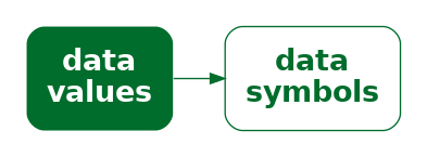
The most obvious example of an encoding is the conversion of data values into data symbols (Figure 1.3). For example, in Figure 1.1, all of the data values for 14-year-olds, the number of offenders for each year, have been encoded to an orange line. The data values for 15-year-olds have been encoded to a blue line and the data values for 16-year-olds have been encoded to a green line. In other words, each row of Table 1.1 is encoded to a separate coloured line.
The heatmap of the same data (Figure 1.2) provides a different visual representation because it employs a different encoding. In this case, the data symbol is a rectangle, with one data symbol for each combination of age and year, and with the colour of the rectangle reflecting the number of offenders of that age for that year. In other words, each cell of Table 1.1 is encoded to its own coloured rectangle.
Deciding on which data visualisation to use can be thought of in terms of deciding how to encode data values.4
1.3 Decoding
What is a data visualisation for? As we saw in the very first section of this chapter, the value of a data visualisation lies in our ability to rapidly and effortlessly extract information. In other words, a data visualisation allows us to convert from a visual representation back to information. We will refer to this process as decoding information.
A simple example of a decoding is the extraction of a single data value. For example, we can decode the number of 14-year-old offenders in 2011 from Table 1.1. More complex decodings involve extraction summaries of multiple data values. For example, we can decode the overall decline in youth crime from the lines in Figure 1.1.
The purpose of encoding data values to a particular visual representation is to enable the viewer to extract properties of the data very rapidly and very easily.
In order to produce an effective data visualisation, we need to encode data values to data symbols in a way that facilitates decoding data values from the data symbols (Figure 1.4). For example, we are able to decode a single value from a text label, like a single number in Table 1.1, and we are able to decode a detailed trend from a sloping line, like the lines in Figure 1.1.
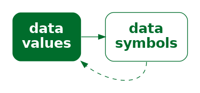
Conversely, a data visualisation will be less effective if it does not support the effective decoding of data values from data symbols. For example, it is more difficult to detect detailed trends from the changing colours of the rectangles in Figure 1.2.
The journey that we take throughout this book will involve exploring a variety of different ways that information can be encoded to a visual representation. We will encounter many different data visualisations, but we will analyse them in terms of the fundamental ways that they encode information.
The effectiveness of a data visualisation will depend on how well information can be decoded from the visual representation. By identifying the different encodings that we can use, and understanding what information can be decoded from different encodings, we will come to understand why some data visualisations are more effective than others for different tasks.
1.4 Summary
Data visualisations can be very effective for communicating information.
However, a data visualisation that is effective for communicating one type of information may be ineffective for communicating another type of information.
The goal of this book is to explain why some data visualisations are more effective than others at communicating different types of information—how data visualisation works.
We will focus on how information can be encoded to create a visual representation. We will characterise a data visualisation in terms of the encodings that it uses to convert data values into data symbols.
The effectiveness of an encoding will depend on how well we can decode the information that we want from a visual representation. We will judge a data visualisation in terms of how well data values can be recovered from the data symbols.
Karsten, Karl G. 1925. Charts and Graphs. Prentice-Hall.
Owen, G. Scott, Gitta Domik, Theresa-Marie Rhyne, Ken W. Brodlie, and Beatriz Sousa Santos. 1999. “Definitions and Rationale for Visualization.” https://education.siggraph.org/static/HyperVis/visgoals/visgoal2.htm.
Tufte, Edward R. 1983. The Visual Display of Quantitative Information. Cheshire, Connecticut: Graphics Press.
Wickham, Hadley. 2010. “A Layered Grammar of Graphics.” Journal of Computational and Graphical Statistics 19 (1): 3–28. https://doi.org/10.1198/jcgs.2009.07098.
Wilke, Claus O. 2019. Fundamentals of Data Visualization: A Primer on Making Informative and Compelling Figures. Sebastopol, CA: O’Reilly Media.
This quote is from an early web resource on data visualisation that was produced by the ACM SIGGRAPH Education Committee (Owen et al. 1999).↩︎
For example, see Part I of Wilke (2019), particularly Chapter 5.↩︎
In fact, pie charts have received a lot of hate from all quarters for over a century:
“In a sense, it might be construed as an insult to a man’s intelligence to show him a pie chart” Karsten (1925, p98).
“the only worse design than a pie chart is several of them … pie charts should never be used.” Tufte (1983, p178).
For some counter-arguments, see Section 7.2.↩︎
The idea of characterising a data visualisation as a set of encodings from data values to visual representations aligns with the idea of mappings from Wickham (2010).↩︎